Brand Guide
The complete visual and verbal identity system for Builtable Labs. This page is non-indexable and intended for internal & partner reference.
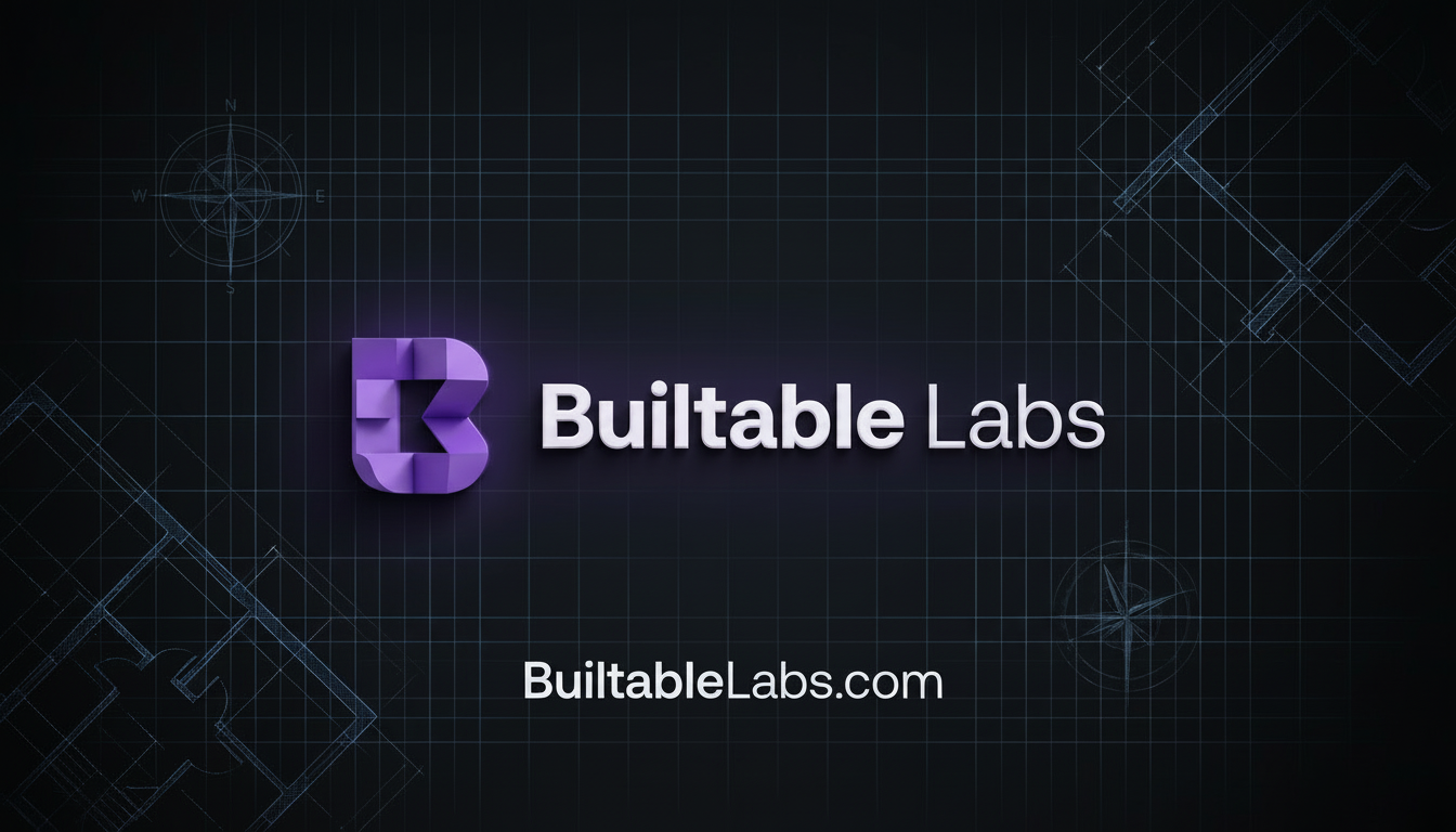
Logo
The Builtable Labs logo consists of the icon mark and the wordmark. Always use the provided assets — never recreate.
Usage Rules
- Maintain clear space equal to the icon height on all sides.
- Never stretch, rotate, or apply effects to the logo.
- The wordmark uses two weights: bold for "Builtable" and light for "Labs".
- On light backgrounds, invert to a dark version when necessary.
Downloadable Assets
Color Palette
Our palette is built on a near-black foundation with Royal Purple as the primary accent. All colors are defined as HSL values.
Core
Background
var(--background)
Foreground
var(--foreground)
Card
var(--card)
Border
var(--border)
Accent
Royal Purple
var(--accent)
Accent Glow
var(--accent-glow)
Accent Muted
var(--accent-muted)
Ring / Focus
var(--ring)
Neutral
Primary (White)
var(--primary)
Secondary (Silver)
var(--secondary)
Muted
var(--muted)
Muted Foreground
var(--muted-foreground)
Typography
We use Space Grotesk across the entire experience — display and body — for a unified, technical feel.
Display / Headings
Space Grotesk Bold
font-family: "Space Grotesk"; font-weight: 700; letter-spacing: tight
Body
Space Grotesk Regular — used for paragraphs and UI text across the platform.
font-family: "Space Grotesk"; font-weight: 400
Light Variant
Space Grotesk Light — used in the wordmark and subheadings.
font-family: "Space Grotesk"; font-weight: 300
Type Scale (Headings)
Gradients & Effects
Signature visual treatments that define the Builtable Labs aesthetic.
Accent Gradient
linear-gradient(135deg, accent → accent-glow → 260°)
Used on CTAs, buttons, highlights
Text Gradient
linear-gradient(135deg, white → accent-glow)
Used on hero headings
Glow Effect
box-shadow: 0 0 20px accent/0.3
Used on hover states, focus rings
Imagery & Photography
Visual content should reinforce our premium, construction-native positioning. Every image must feel intentional and grounded in reality.
✓ Do
- Use real jobsite photography when available
- Favor dark, moody tones consistent with our palette
- Show tools, materials, and environments; not stock poses
- Audit AI-generated images for anatomical accuracy (natural proportions, visible heads, correct limbs)
- Use high-resolution assets (minimum 1200px wide for heroes)
- Apply subtle overlays or gradients to maintain text legibility
✗ Don't
- Use generic stock photos of people shaking hands or pointing at screens
- Use bright, saturated imagery that clashes with our dark foundation
- Use AI-generated images with visible artifacts (extra fingers, distorted faces, floating limbs)
- Place unprocessed images directly on pages without tonal treatment
- Use imagery that could be mistaken for any other industry
- Fabricate photos implying real client work or testimonials
Image Treatment
Hero Images
Full-bleed with dark gradient overlay. Text always on top. Minimum 60% opacity overlay for readability.
Card Thumbnails
16:9 aspect ratio. Rounded corners matching the card radius. Lazy-loaded with descriptive alt text.
Headshots
Square crop, consistent lighting. Used on the About page and in team-related content only.
Downloadable Team Assets
Component Patterns
Key UI patterns used across the site.
Card (Elevated + Hover)
Cards use the card-elevated and card-hover utility classes. Border lifts to accent on hover.
Spacing & Layout
Consistent spacing creates rhythm. All values follow Tailwind's 4px base grid.
Container
Section Spacing
Grid Gaps
Card Padding
Border Radius
Spacing Scale (Visual Reference)
Icons & Illustration
We use the Lucide icon library exclusively. Icons are functional, not decorative.
Icon Library
Sizing Scale
Inline, buttons, metadata
Navigation, form fields
Card headers, toggles
Section icons, feature cards
Hero accents, large callouts
✓ Do
- Use icons to reinforce meaning, not replace text
- Keep icon color as
text-muted-foregroundortext-accent - Pair with labels on interactive elements for accessibility
- Use consistent sizing within the same component context
✗ Don't
- Mix icon libraries (no FontAwesome, Heroicons, etc.)
- Use filled/solid icon variants
- Apply custom stroke widths
- Use icons as standalone buttons without accessible labels
Social Media & OG Images
Every core page has a unique Open Graph image for social sharing. All OG images must use absolute URLs with the www subdomain.
OG Image Specifications
Dimensions
1200 x 630px
Format
JPG
URL Pattern
https://www.builtablelabs.com/og-default.jpg
Global OG Image
All pages use a single branded OG image for consistent social sharing across every platform.
All Pages
og-default.jpg
Social Sharing Rules
- All
og:imageURLs must be absolute (include full domain) - Title tags under 60 characters with primary keyword
- Meta descriptions under 160 characters
- Blog posts use dynamic OG via their hero image
- Legal/utility pages use
noindex, follow
Platform Tags
Twitter/X
twitter:card = summary_large_image
Facebook/LinkedIn
og:type = website
Structured Data
JSON-LD Article schema on blog posts
Voice & Tone
How we sound. Our language is direct, technical, and grounded in operational reality — not generic SaaS marketing.
✓ We Say
- "We engineer internal systems around how your crews actually work."
- "Your workflows drive the technology — not the other way around."
- "Construction-native software architecture."
- "Internal Tech Architecture Partner"
✗ We Don't Say
- "We build apps." (too vague)
- "Revolutionize your business." (generic)
- "AI-powered solution." (buzzword-first)
- "Software development agency" (commodity framing)
Positioning
Key phrases and positioning pillars that define how Builtable Labs shows up in the market.
Tagline
Internal Tech Architecture Partner for Construction
Key Differentiators
- Construction-native — not a generic dev shop
- Workflow-first architecture — software mirrors your operations
- Outcome-based pricing — not hourly billing
- Internal systems — not another SaaS platform
Primary Domain